TL;DR
- Hand a UI to AI without specific direction and you’ll almost certainly end up with a “purple gradient.”
- I rebuilt the design using Claude Code + Playwright MCP + a design AI (Stitch).
- The new palette is amber-500 (amber), with a terminal/code-inspired look.
The Purple Gradient Problem
This blog, “Zero-Shot Log,” originally had its design generated by AI.
It didn’t look bad. But it felt familiar — like I’d seen it somewhere before.
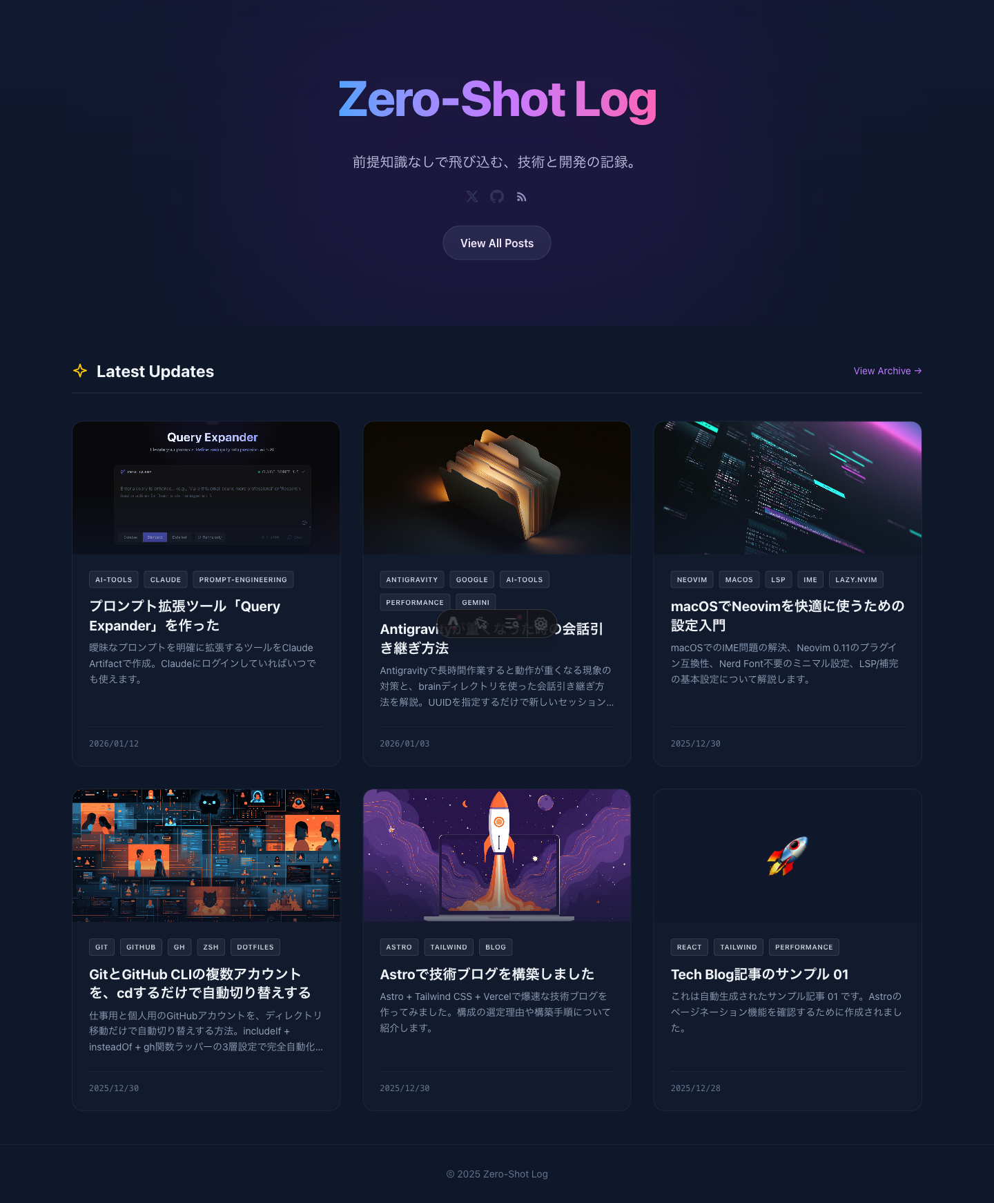
The culprit: the “purple gradient.”
I came across an interesting post about this on X.
AIになにも指示せずにHTMLを作らせると、高確率で紫のグラデーションを使ってくる気がするのですが、何の学習を経て、紫を学んだんだろう。 pic.twitter.com/7oAgKmjhko
— たにぐち まこと/学ぶ。をちゃんと (@seltzer) January 12, 2026
A reply pointed out that this is heavily influenced by Tailwind’s bg-indigo-500.
どうもTailwindのbg-indigo-500の影響を大きく受けているとこちらのポストで言及がありました。https://t.co/Dqk2DBzPL8
— まさやん【AIハック】- AIであらゆるクリエイティブと開発を効率化・自動化するノウハウをお届け (@masayan_ai_hack) January 12, 2026
AIは最も頻繁に目にするものを模倣し、さらにモデルは青紫のグラデーションがウェブデザインにおける「最適な」デフォルトであることを自然に学習した結果のようです。…
The theory is that AI learned indigo/purple gradients as the “optimal default” from its training data.
I decided it was time to break out of that pattern.
The Renewal Workflow
For this redesign, I combined three AI tools.
1. Capture the current state: Claude Code + Playwright MCP
First, I connected Playwright MCP to Claude Code and took screenshots of the current site — the top page and an article page, on both desktop and mobile.
This way I could communicate the “current state” accurately when briefing a designer AI.
2. Write the design brief
Based on those screenshots, I wrote a design brief (design-brief.md) for the designer AI. It included:
- Site info (name, concept, page structure)
- The current color scheme and what was wrong with it
- Design elements to avoid (purple gradients, flashy glows, etc.)
- The direction I wanted (minimal, warm dark, terminal/Vibe Coding aesthetic, etc.)
The idea is to control AI output by being explicit about what you don’t want.
3. Hand it to the design AI (Stitch)
Stitch is a UI generation tool from Google Labs. Powered by Gemini 2.5 Pro, it generates UI designs from text or images. Currently in beta and free to use.
I passed the screenshots and the brief to Stitch and got back a new design proposal.
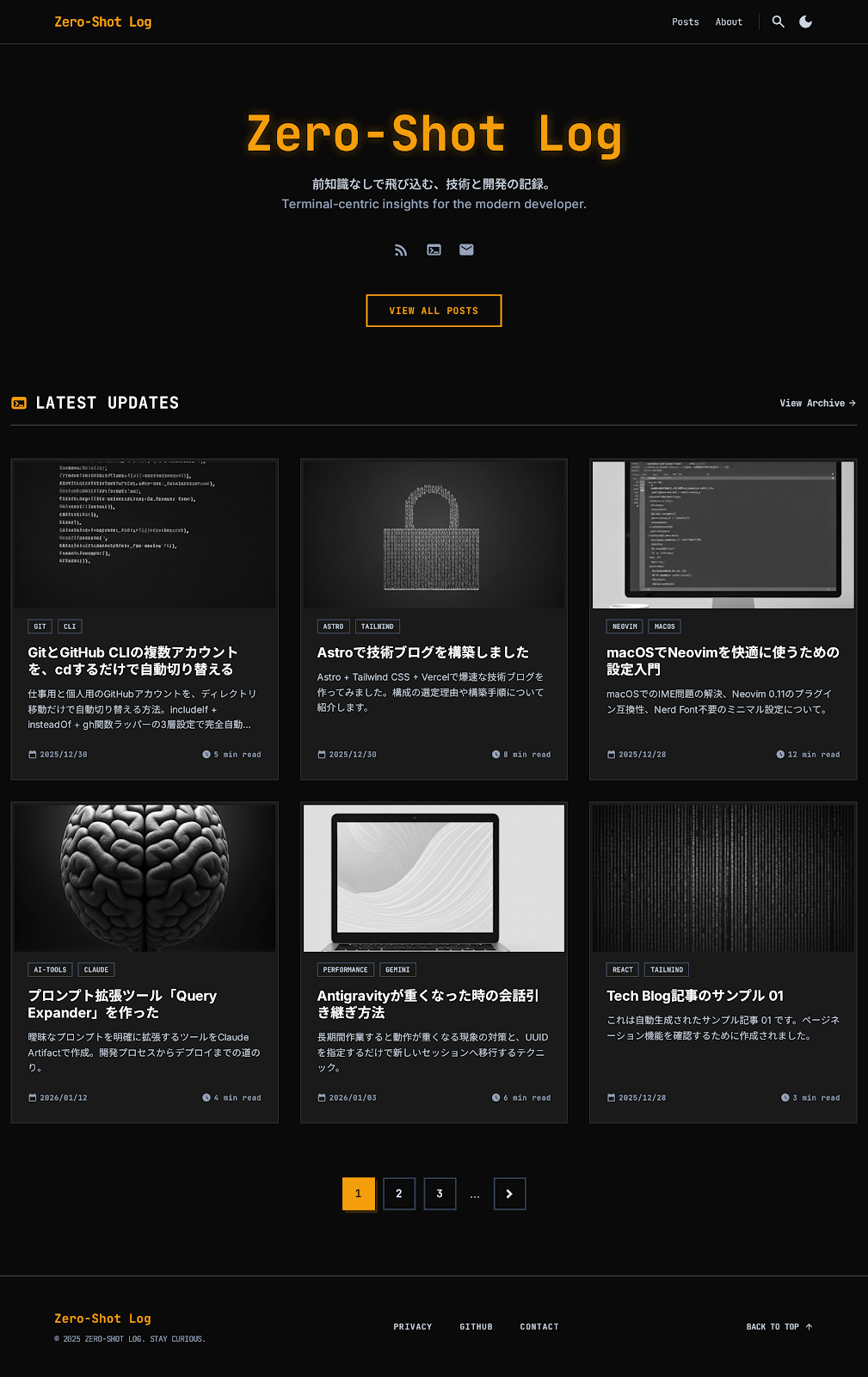
What came back was an HTML file plus preview images. The warm amber palette was applied as requested.
4. Implementation
Stitch’s output includes HTML, but it’s mainly there to fill in details that an image alone can’t convey. You can’t just drop it into existing Astro components, so I rewrote the styles in Claude Code while taking the color palette and font choices as references.
Wrap-up
- The “purple gradient” problem in AI-generated design is avoidable with explicit direction.
- The flow of “screenshots + brief → design AI → implementation” makes redesigns go smoothly.
It’s a good time to be alive — design renewals are this easy with AI now.